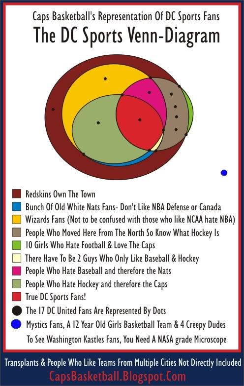
In theory it represents people who only like DC sports teams. Therefore it is somewhat of a representation of people's favorite sports. However I believe people like certain sports with a certain level of passion based on where they live. In this case DC. Like that Merry-Go-Round?
Basically you could substitute a Nats for an Orioles, but you couldn't shift this whole chart to Toronto. Well I'm not going to confuse you any longer. Just take a look at this confusing piece of art:

No I did not use any stats from this Washington Post DC Sports Fan Poll.
As you can see I think everyone loves the Redskins. Since the Nats were late to the party, most DC sports fans like them if they didn't already have a team. You can figure out the rest of the diagram on your own maybe.

 The DC Sports Fan Venn Diagram


3 comments:
I'd be part of that white area, as I only really like hockey, and I work for a baseball team.
Girls can like baseball and hockey but tolerate football...
The more seasoned site was assembled utilizing a static distributed model that implied we needed to make a "format" for each perspective of our substance we needed to present to the gathering of people, making it a great deal all the more immoderate to re-reason and convey to various areas of the site and crosswise over portable as well as the pages were made bespoke for every game.
Source: tennis club management software
Post a Comment